
 OK, I'm sick of the dots. I want something simple but faaaaaaabulous for my blog design. Something that won't over-shadow my outstandingly pithy writing and oh, so appropos illustrations. Something very Shorty PJs but not shorty-pjs-slutty ("Ahm a good girl, I ahm...").
 Something with a bit of this.
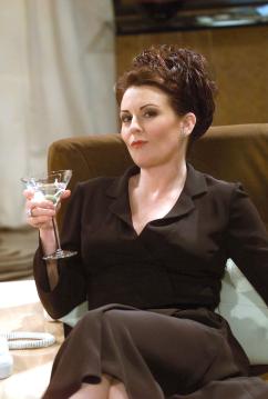 And a hint of this.
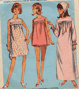
Just a smidge of this.

 Two dabs of this.
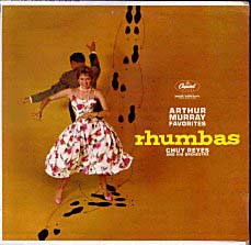
1/4-teaspoon of this.
 A wand-wave of this-here sort of thing.
 A wand-wave of this-here sort of thing.
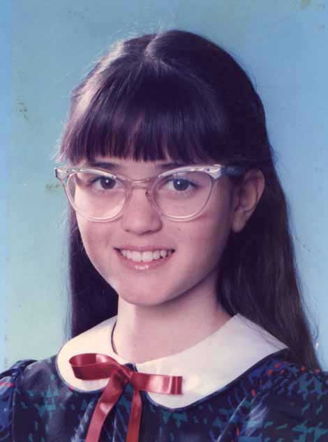 And maybe an eye-squint of this.
I haven't a clue as to how to design something that captures the spirit of Her Nibs Shorty PJs. I don't know where to start. I'm a writer, not a Photoshoppy-doo-da person. But I'm really sick of the dots. Huff.
6 comments:
Being an injuneer, I can't help you on that. My logical approach, Mr. Spock, would be to just dump the dots in favor of a clean white slate, then see what ideas develop. The dots are different, unusual, and I for one don't mind them. But they do distract from trying to see something else.
Maybe one of your readers is a graphics designer and can offer some constructive comments. One that did do a redesign recently was aldahlia (see on my blog list). It may not be the kind of thing youre looking for, but very classy and different nonetheless.
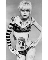
Is that Goldie Hawn from "Laugh In" days?
Yeah - I don't really know what I want. I need to design a banner with a graphic image and font style that suits me. If the rest of the page is clean white, that's fine.
Yep - Goldie Hawn on Laugh-In.
Just sock it to 'em!!!
OK - whew. Dots are gone but it was a real hassle, let me tell you. I obviously need to take this blog re-design thing veeeeeery slow.
I have that rhumba record!!
Jane, anyone who has that rhumba album is a gal after my own heart! I love the cover - there's something so classy, fun, and bygone about it.
Post a Comment